Global Mind Health
A research platform designed for a PhD student, supporting participant recruitment and presenting the study’s purpose, progress, and resources.

Overview
This site supports an ongoing study by offering clear research information, participant guidance, and contact resources that reflects academic professionalism and empathy.
My Contribution
I led the end-to-end design and development of a research platform that prioritizes clarity, accessibility, and trust.
Discovery
I kicked off the project by leading a discovery session to identify the client’s goals, user pain points, and design expectations. This conversation revealed two key insights that informed the core design strategy.
01. Sensitive, Empathetic Design
The target audience included young adults experiencing depression symptoms. This called for a design approach that prioritized emotional safety, calmness, and a sense of quiet reassurance from the first touchpoint.
"I want users to feel quietly reassured the moment when they land on the website."
02. Purpose-Driven Functionality
Beyond presenting research content, the client wanted to offer a space for anonymous peer discussion. This required designing a low-barrier, secure communication platform that respected user privacy while encouraging participation.
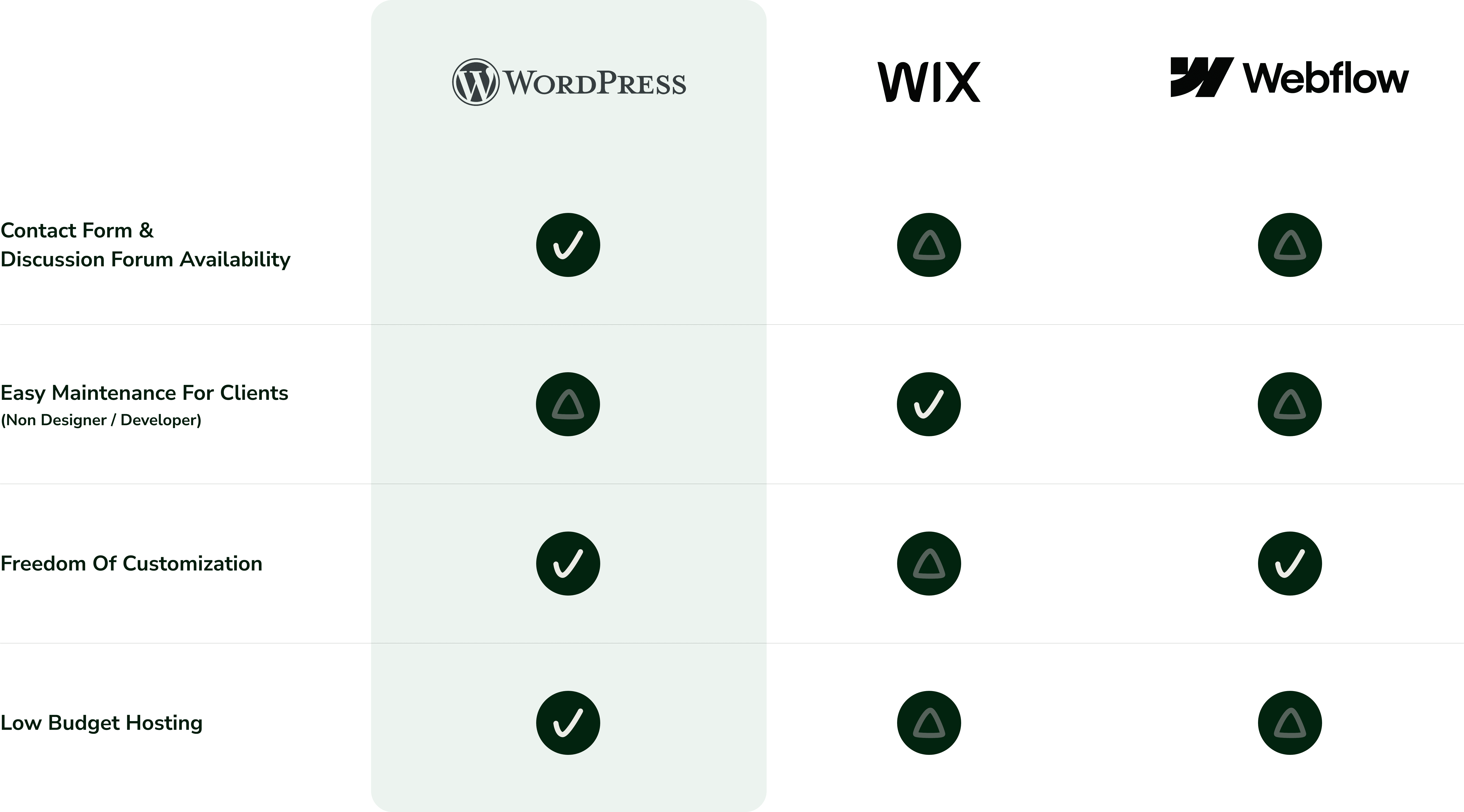
CMS Platform Decision Process
After analyzing CMS platforms in close collaboration with the client, I selected WordPress for its balance of feature availability, customization flexibility, and budget-conscious maintenance. The decision aligned with both the project’s functional needs and long-term scalability goals.
Wireframing
Prioritizing user-friendly navigation, I created low-fidelity wireframes. I carefully mapped out each page’s layout to step into the design and development phases smoothly.

Typography
To balance clarity and emotional trust, I chose Source Sans 3 for its modern, structured feel and Open Sans for its high readability on all devices. This pairing ensured that users could easily scan the content while still feeling supported by a calm and professional tone. It is key for a research audience navigating sensitive topics.


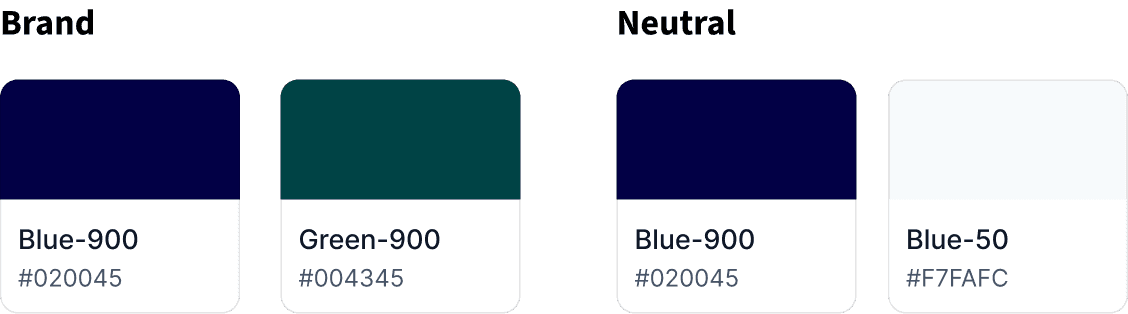
Color Palette
I selected the color palette to reflect both brand identity and user emotion. Deep blue was used to establish credibility and academic professionalism, while green introduced a sense of calm and emotional balance. Together, these colors were chosen to reduce friction and build trust, especially important for users navigating mental health topics.
Implementing in WordPress
After finalizing the design, I built the website using WordPress. I selected it because it offers the right balance of customization, ease of maintenance, and budget suitability. I evaluated several CMS platforms and chose a theme that aligned with both the visual hierarchy and functional structure defined during earlier phases. To meet the client’s needs for low-friction contact and anonymous discussion, I customized plugins and optimized interactions to ensure clarity, usability, and trust across the platform.

What I learned
Client Collaboration
Collaborating closely with the client helped me navigate the balance between design expertise and client priorities. Instead of passively executing requests, I framed suggestions with clear rationales, which helped build trust and align decisions toward shared goals.
Practical Plugin Experience & Expanded Understanding
Evaluating and configuring plugins helped me align technical decisions with UX priorities such as accessibility and scalability. This exploration process strengthened my ability to balance user needs with platform constraints.
Design Scalability Consideration
I considered how the design would scale with additional content or features. Structuring the navigation, components, and layout patterns with modularity in mind allowed for long-term flexibility and consistency as the platform grows.
What If I have more time
Documentation & Handoff
While I offered CMS guidance, I recognized the need for scalable documentation practices. I aim to develop better handoff strategies to support long-term usability, particularly for non-technical stakeholders managing ongoing content updates.